I have been a loyal smugmug user since 2004. I am such an old user of smugmug that when they did their big reveal they reached out to me twice to see if I would come to their HQ for the big reveal.
I was touched. And very excited. For years they have been the best place to store and view pictures. And I have happily spent 50$ a year for the privilege of having them store my pictures…
The process to get to the new UX … which looks a lot like the windows 8 UX… was
- Preview the new look and feel
- Update your page to the new look and feel.
So here’s the dialog that asks if you want to upgrade
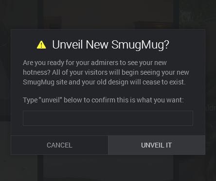
Looking at this UI, there appears to be a progress bar, and two buttons.
Because I am an engineer who doesn’t RTFM, I click on the button ‘UNVEIL IT’ expecting the progress bar to start advancing…
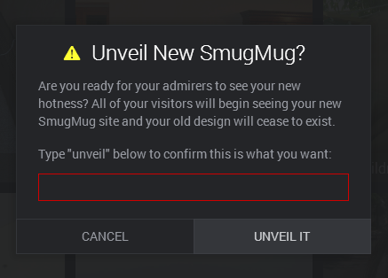
And I get this red box. Which is surprising. I think… huh, something must be wrong at smugmug. Or this is going to take a while. So I let my computer sit overnight waiting for this progress bar to advance.
Fortunately my brilliant wife does RTFM, something about doing research I think, and points out that I must type the word unveil in the text box.
Ah!
I do that and get the new UX.
So yes, I am a fool for not reading the instructions. But a great UI has to not rely on the user to read the instructions. Or when the user fails to read them provide the right kind of information so they can take corrective action.
I wonder how many people are spamming customer support.